I don’t know where I would be without Adobe. InDesign, Photoshop and Illustrator have been my go-tos since I was laying out pages for The Scroll as a News Editor in middle school. And although my role now bridges an online publication and a print publication, the allure of creating stunning, eye-capturing designs has always been special to me. My love for design is what makes it difficult to witness the slow demise of print media across the world. But, I’m thankful to still have the opportunity to design print pages for The Standard and to keep print journalism kicking. Here are three print designs of mine I’ve picked out as my favorites.
Impeachment inquiry drives political uncertainty
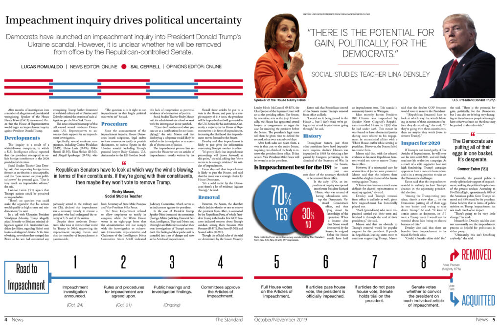
Funnily enough, the design you see above was not put together until very close to deadline. On the Thursday of our layout week, I completely scrapped the horrendous design I had on the spread at the time and got to work on this one in the remaining 24 hours I had until deadline. It’s remarkable what you can do in such a short period of time when you get that rush of design excitement. Given the subject matter, the use of color was very intentional, and I feel as though I have seamlessly incorporated multiple elements that enhance the reader’s experience: pull quotes, an infographic, an explanatory timeline and photo cut-outs.
COVID-19 resurgence threatens campus operations
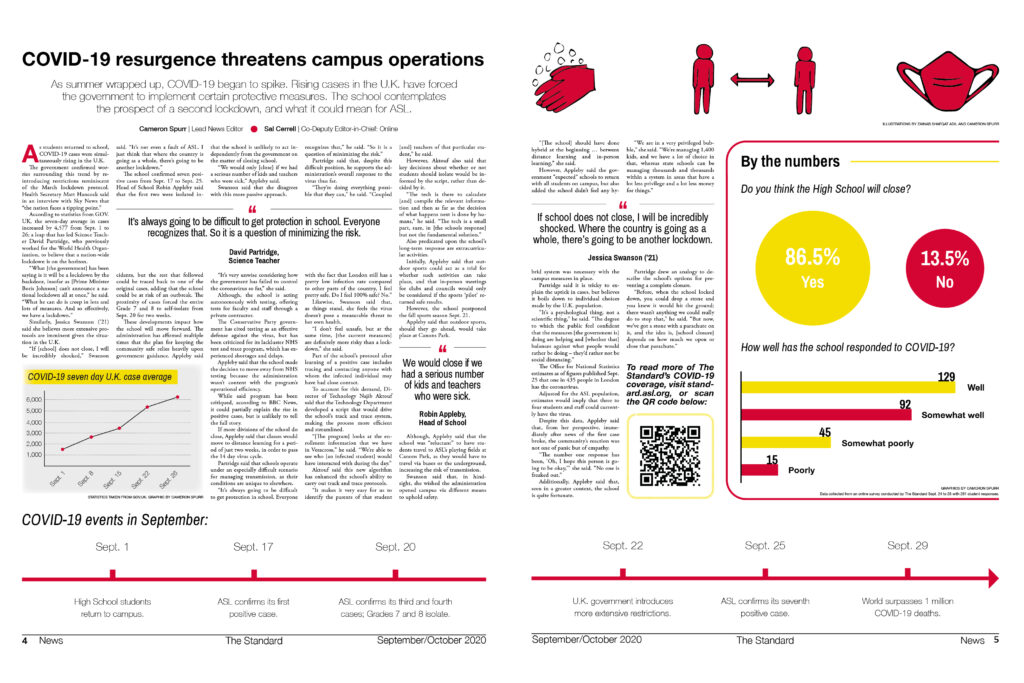
Similarly to the impeachment spread above, this two-page spread utilizes graphic elements with purpose to supplement the text. I co-wrote this news article about how our school was responding to COVID-19 developments in the U.K. at the beginning of last school year (fall 2020). As such, I decided that a graph representing increasing case numbers (bottom left) was appropriate. As well, there is a timeline laying out key events in the progression of the pandemic at the time, mentioning key points at our school as well as in the U.K. and across the world. I designed infographics on the right to exhibit data we had solicited from the student body as to their opinions on the situation. Altogether, these elements create a visually pleasing spread and a cohesive print package.
Roadmap out of UK lockdown guides ASL
I took these photos on a 20-minute rushed trip to our local high street one day during class. In hindsight, I probably shouldn’t have so carelessly run off campus with a multi-hundred-pound camera around my neck, but there are no shattered lenses to admit here, so I got away with it. I wanted these photos to capture the essence of the article, which is why in the first shot I centered this woman crossing the street with her mask on. The Pret A Manger in the background is also a very relatable image for our community as it is a popular lunch spot, and business had been very slow at this point in the U.K.’s lockdown. For the second shot, I took of the Duke of York Pub – another neighborhood favorite – displaying a sign in its window that it will be able to reopen on April 12 with outdoor seating only. This symbol was directly correlated with what the article and my sources discussed. Further, I created a bar chart at the top left of the page based on survey data of our student population. This design was a prime example of marrying text with visual storytelling devices in the shape of photos and an infographic in print.
